The Project
This project was to provide a tool that would let people visually infer patterns and outliers from vast amounts of census data.
The design is based on Ben Shneiderman's mantra for data visualization: "Overview first, zoom and filter, then details on demand." The software comes with three interactive views: The colored map and scatterplots provide visual overviews. The sliders provide a way to filter out states based on value ranges. The visualizations coordinate: selecting states in one view selects them correspondingly in the other two views. One can answer questions such as "which states had unemployment ranging from 10%-20% ?"
The Clients
U.S Census Bureau
My role
- Debugging and testing
- Programming
- Analysis of video taped user sessions for design improvements (usability)
Technologies/Resources
- Visual Basic 6.0
- Visual Fox Pro
- ESRI map objects
- VHS tapes of recorded user think aloud sessions
- 2 programmers
Usability Methods
- Benchmark tasks
- Think aloud sessions
- Video of users
- Screen capture
- Cognitive walkthroughs
- Heuristic evaluation
Technologies/Resources
- Panda 3D game engine
- Python scripting
- Adobe Photoshop
- Adobe Audition
- Final Cut
- Team of three - Research and design (me), compositor and programmer
Methods
- Scenario based design
- Searched several layouts for inspiration
- Paper prototypes
- Expert reviews
Census Data Visualization
Methods
Technologies/Resources
- Participant and monitor rooms
- Techsmith Morae for testing
- Benchmark tasks for users to complete
- C# .Net/ Visual Studio .Net
- Visual Foxpro data tables (Census Bureau)
- ESRI Map Objects 2.0
Methods
- Think aloud testing
- Benchmark tasks
- Screen captures
- Comparitive studies of versions
- Heuristic evaluations
- Developed framework to analyze relational visualization tools
- IRB procedures
Methods
The Project
This was for a science museum kiosk featuring educational games. My observations showed that adults skim through exhibits quickly to understand enough about it to explain to children and lead them through activities.
So I designed browsable material that was split into short chunks corresponding to the different games in the kiosk, accessible from the game screens. This balanced contrived game rules (fun for children) versus more realistic representations of the science (understanding for adults)
The Clients
- Duquesne University, Carnegie Science Museum
My role
- Information and interaction design
- Hardware and software procurement
- Production
- Layouts and some of the video compositing
- 5 rounds of field and lab testing
- 2d and 3d art assets using maya, photoshop
The Project
A study revealed that novices to data visualization software resorted to reading tables of numbers to spot outliers or patterns in the data, instead of quickly glancing at visual patterns which is much faster and easier. Why did this happen?
I hypothesized reasons, designed and prototyped a proof-of-concept visualization tool geared towards novices. The video shows a novice user successfully using the colored map in the new prototype.
Client
Virginia Tech. Done as my Master's thesis.
My role
- Iterative testing, design and development
- Making a framework to analyze interactive visualizations in terms of their "learnable" elements
- Derivation of design principles for learbability
Technologies/Resources
- SPSS statistics package
Methods
- Objective metrics from Alexa.com
- Subjective ratings from participants
- Controlled experimental design
- Multidimensional scaling and clustering of data with SPSS
Methods
The Project
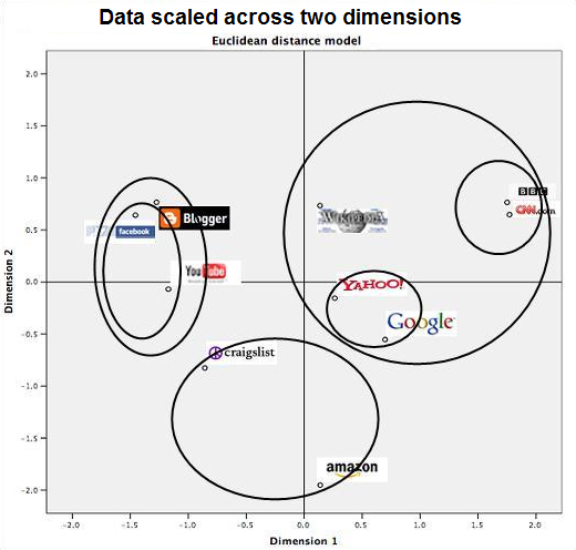
How do people perceive similarities between websites? Are Facebook and Blogger more similar or Facebook and Youtube? In this preliminary experiment, 10 popular websites were studied using objective and subjective metrics, and analysed using statistical packages.
Hierarchial clusters emerged in the data. For instance, Facebook and Youtube are in a cluster. The facebook-youtube cluster and Blogger form a bigger cluster. The users also seemed to be using two dimensions while comparing websites for similarity. Dimension 1 is likely to be "credibility." Dimension 2 was unexpected, and perhaps it is "commercial-ness." All subjective data was analysed using statistical packages.
My role
- Making hypotheses
- Running statistical analyses
- Facilitating tests - instructing users
- Interpretation of results
- Documentation and presentation
Technologies/Resources
- Paper prototyping, powerpoint, HTML and flash for rapid prototyping
Methods:
- Scenario based design process
- Schneiderman's Visualization Mantra as design philosphy
- Likert scales
- rapid prototyping
- scenarios and personas
- analyses using GOMS NGOMSL
- Independent usability consultants gave comparitive evaluation against six competing designs
- Highest user ratings among 7 designs
Methods
The Project
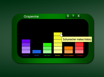
The Grapevine project was in response to a challenge thrown to 7 usability teams to create a visual form of news headline notification. People want to do their tasks and see news when they want to take a break.In keeping with this workflow, Grapevine icon glows in the task-bar if there is a new headline. Upon clicking the icon, the Grapevine window opens.
News categories are present as stacked bars. Headlines appear as tool tips. Clicking the bar opens the news page. This was rapidly prototyped in HTML to show functionality and tested with users.
My role
- Usability - Information and interaction design
- Personas and scenarios
- Post-test results processing
- Documentation
Browsable text and movie clips on a touch screen kiosk, for a science museum
A user thinks aloud while using the proof-of-concept visualization tool.
People perceived clusters of similar websites - shown as circles. They also rated similarities based on two dimensions, as the plot shows.
Grapevine visual news notification system - prototype
These are projects in which I worked as one or more of the following: interface designer, programmer, or researcher. I list full development projects, prototype design projects, or pure research projects.
Census Data Visualization Tool: Development & Testing
Census data visualization tool with color-coded map, histograms, and 2D scatter plot
Methods
Museum kiosk content: Design, Development, & Testing
Visualization for novices: Design, Development & Testing
User perception of website similarities: Research
Visual News Notification: Design, Prototyping & Testing

Sujatha "Sue" Krishnamoorthy
USER EXPERIENCE DESIGNER
User interfaces
Methods
The Project
You can talk with a librarian in a physical library. But you get instant access to remote content in a digital library. Can we combine the best of both worlds?
The OCKHAM initiative, a large undertaking of four Universities, aimed to combine traditional and digital library services into a peer to peer network.
I researched NSDL, and various existing digital library models including OAIS and OAI . I also conducted focus group interviews with educational technologists and traditional librarians. I used these inputs to recommend an architecture for OCKHAM.
Clients
- The OCKHAM initiative (comprised of digital library labs of four universities)
My role
- Research of existing architectures/ models
- Focus group interviews and analysis
- Information architecture design
- Documentation and presentations
Technologies/Resources
- OCKHAM proposal
- audio taping
- OAIS reference model
Methods
- Focus group interview
- Transcription and analysis
- Study of existing architectures
- Architectural design
Architecture for Digital Library Network: Research & design
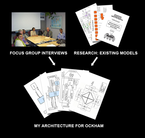
OCKHAM Digital Library Architecture